
Bumble BFF: The Third Place
A place-based way to make friends: join a group for a spot you love, meet people who want to go too, and actually show up.
COURSE
Advanced Interaction Design, CMU
ROLE
Product designer, end to end
PLATFORMS
iOS, Android, desktop, Apple Watch
TOOLS
Figma, Figma Make, Lovable
LONG STORY SHORT
The brief asked me to polish a location-sharing feature to drive premium sign-ups. I stepped back, moved the idea from Bumble Dating to Bumble BFF, and designed for real friendships first.
01
Reframe
Questioned the brief and found the real problem: low engagement, not a missing feature.
02
Design
Built onboarding, discovery, meetups and a premium tier across four platforms.
03
Prototype
Explored with vibe coding, then built clickable Figma prototypes and demo videos.
THE BRIEF
Grow premium, with location
The goal was to increase conversion to premium, and the PM brief had already proposed location sharing as the answer. The data I was given told a different story.
ADOPTION
Low across every group
Location features were not being picked up, whoever the user was.
RETENTION
Dropped off quickly
The people who did try them did not stay.
SIGNAL
Map beat alerts
Map Integration did slightly better than Proximity Alert. People responded to discovery in context.
THE REFRAME
The problem wasn’t a missing feature. It was that people had no reason to meet.
IF I FOLLOWED THE BRIEF
Polish the PM’s location-sharing idea and add premium gates around visibility. Logical on the surface, but designed to hit a metric, with privacy left as an afterthought.
WHAT I DID INSTEAD
Move to Bumble BFF, where meeting people in real places feels natural. Make the free experience valuable first, so upgrading feels worth it, with privacy built in.
EXPLORING WITH VIBE CODING
Many directions, before one
I started with Lovable and Figma Make to explore what the feature could feel like before committing. Some tools were faster for generating ideas, others better for refining structure. It surfaced flows and moments I had not planned, which made the later design much clearer.
Figma Make prototypeThe vibe-coded discovery experienceOPEN ↗ONBOARDING
Three screens to get it
A short intro explains the idea in plain words, and the last screen makes the promise that matters most: you control what you share and can leave anytime.
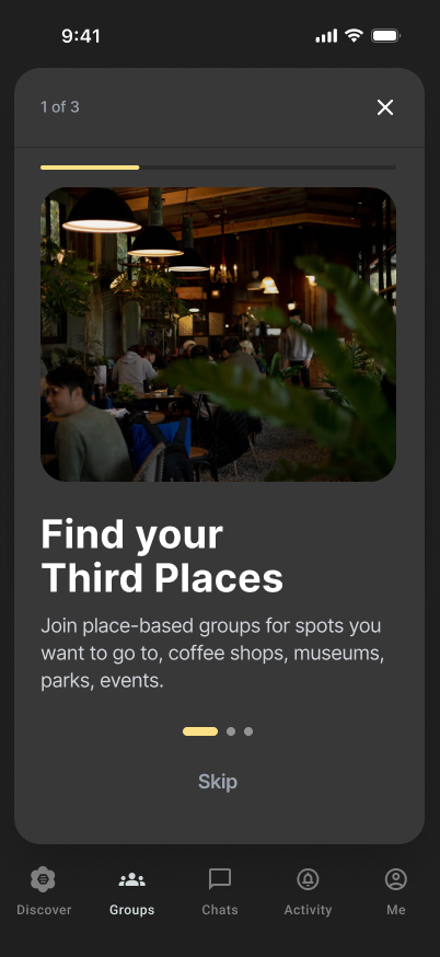
Find your Third Places
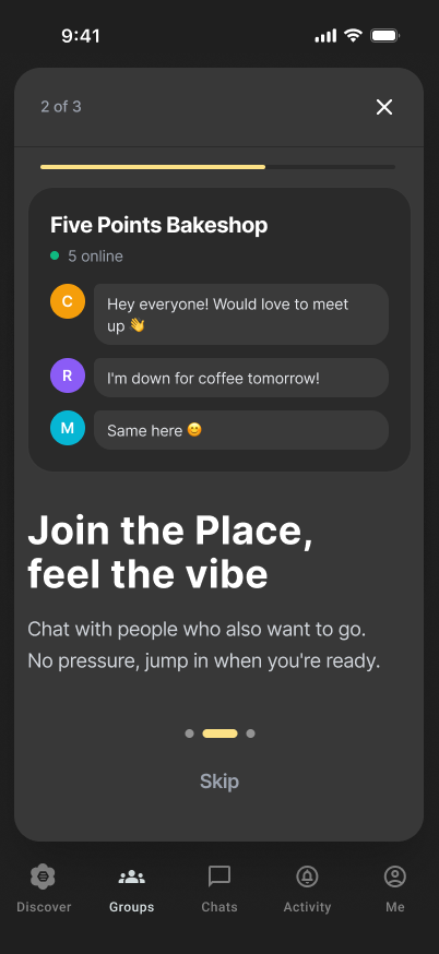
Join the place, feel the vibe
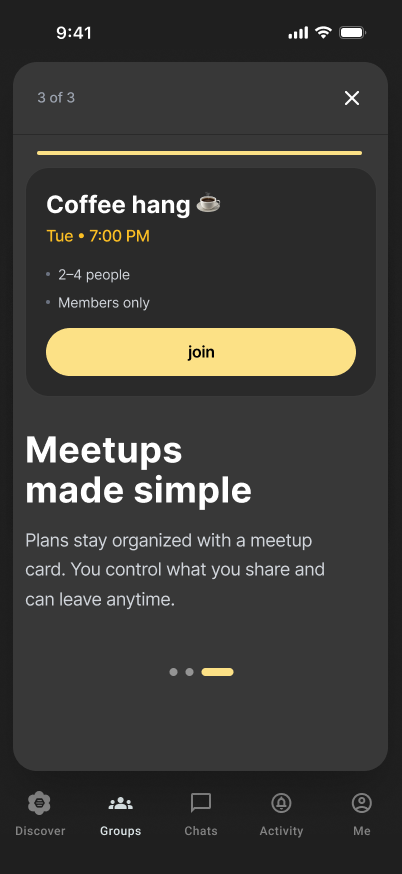
Meetups made simple
FLOW 1 · NEW PREMIUM USER
From a map to a plan
Location is opt-in, with a clear “Not now”. Places glow on the map as yellow BFF flowers, and each one opens into a group chat where anyone can start a meetup.
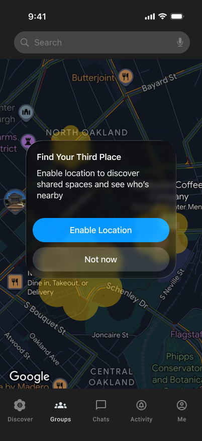
Opt in, or not
Location is never assumed.
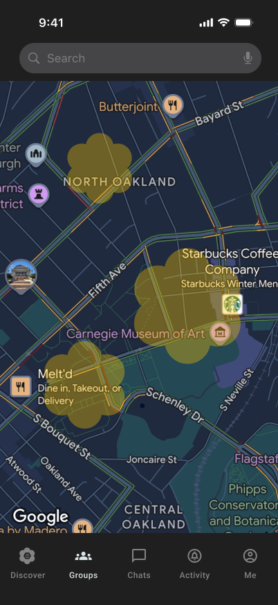
Discover places
Groups glow on the map.
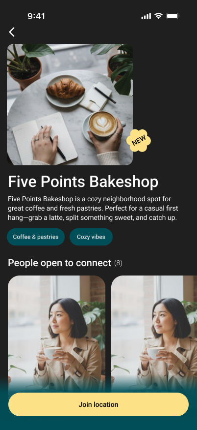
Pick a place
See the vibe and who’s open.
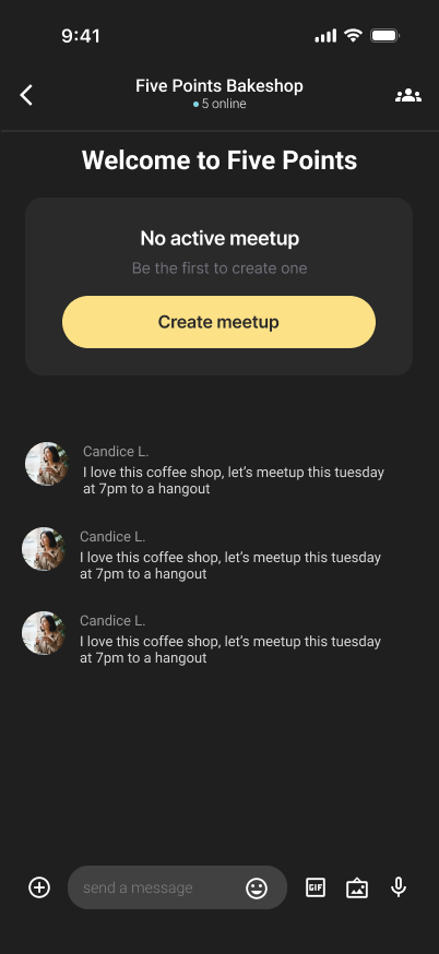
Start something
Be the first to create a meetup.
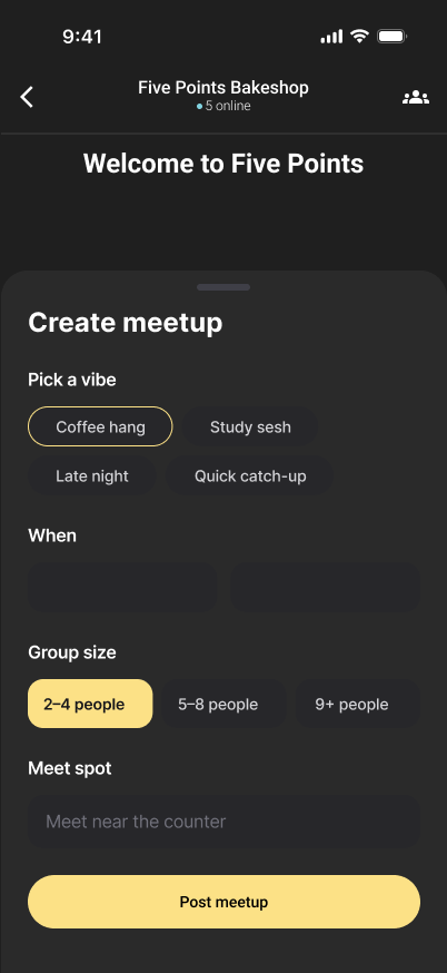
Set the vibe
Vibe, time, size and spot.
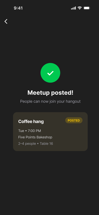
Posted
Others can now join.
FLOW 2 · RETURNING FREE USER
Free is useful. Premium is more.
Free users can join meetups at a few places. Premium unlocks every location, shows everyone who is there, and removes the swipe limit. The upgrade sells more of something people already enjoy, instead of a paywall in front of it.
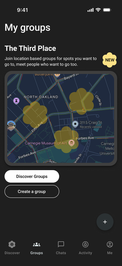
Your places
Groups you’ve joined.
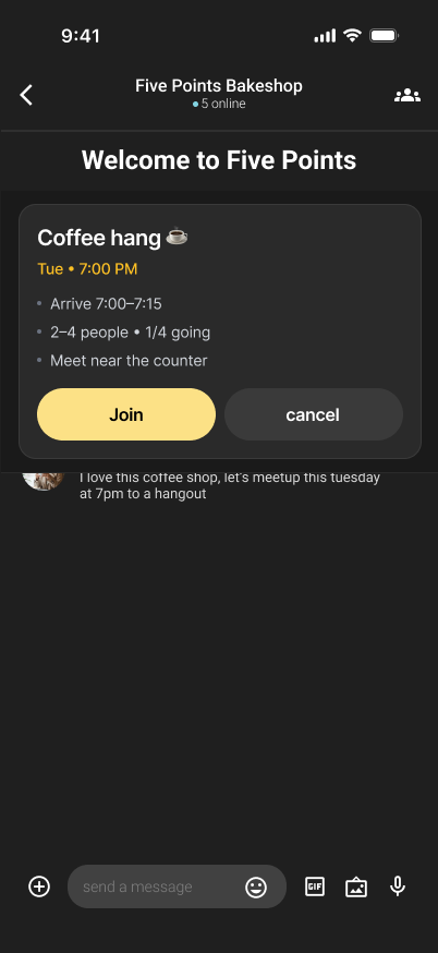
Join a meetup
Small, clear and low-pressure.
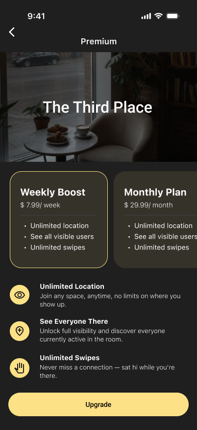
Upgrade
Weekly Boost or Monthly Plan.
APPLE WATCH
On the way, on your wrist
The watch covers the moment that decides whether a meetup happens: getting there. It sends a reminder, gives directions, and tells the group “I’m here” with one tap.
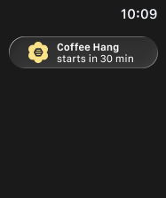
Reminder
30 minutes before.
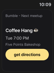
Directions
One tap to get going.
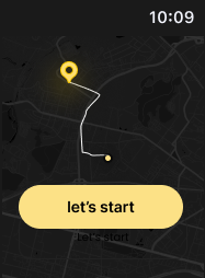
On the way
Turn-by-turn on the wrist.
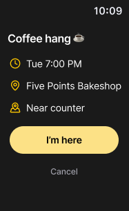
I’m here
Tell the group you arrived.
DESIGNING IN BUMBLE BFF’S SYSTEM
Same brand, different energy
Bumble BFF uses dark mode with bold type and strong contrast, a very different feel from Dating. I had to decide where to follow the system and where to adapt for usability, because dark interfaces change how hierarchy, spacing and colour behave.
BASE
Dark mode first
Every screen designed for dark, where balance feels different from light.
ACCENT
Bumble yellow, used sparingly
Saved for actions and places, so it always means “tap here” or “go here”.
TRUST
Low-pressure language
Copy like “No pressure, jump in when you’re ready” keeps meeting strangers feeling safe.
PROTOTYPES AND DEMOS
Try it yourself
Click through the app the way a new user would: find a place, join a group and plan a meetup.
OPEN IN FIGMA ↗WHAT I TOOK AWAY
01
Reframe before you build
Executing a request is easy. Finding the right problem is the real work, and it is what separates a task-driven designer from a product builder.
02
Data guides, it doesn’t decide
The numbers showed what was happening. Designing still meant asking why, and looking for value the data could not show.
03
Test the assumptions
With more time, I would interview BFF users and test the meetup flow, to see whether it truly feels safe and low-pressure.