
NYU Library: Productivity Pods
Redesigning how students find and book study space, so the library works for both quiet focus and group work.
TIMELINE
Sep – Dec 2023
ROLE
UI/UX designer and UX researcher, digital booking system
TEAM
Karen Xu, Liza, Caitlyn
COURSE
UX Design, NYU
LONG STORY SHORT
Students treat the library as a workspace, but finding the right seat was a gamble. I designed a booking system that shows what each space is, what is inside, and when it is free.
01
Research
Observed the New York Public Library and NYU Bobst, and ran 8 interviews as a team.
02
Design
Owned the digital booking system, from user flow and wireframes to the final UI.
03
Iterate
Tested a second round with users and design mentors, then refined the system.
RESEARCH
Libraries became workspaces
We visited the New York Public Library and NYU’s Bobst Library to watch how people actually use them. Modern libraries are busy places for work and study, and students, the main users, need very different spaces depending on the task.
PAIN POINT 01
Limited seats
Spaces were booked far in advance with no limits, so others never got a turn.
PAIN POINT 02
Limited resources
It was hard to know which rooms had the tools a student needed.
PAIN POINT 03
Uncomfortable environment
Quiet and group work shared the same spaces, and nobody was happy.
WHO WE DESIGNED FOR
USER PERSONA
Jennifer
Third-year college student, studying music in NYC. Plays several instruments, is learning to write music, and dreams of becoming a music teacher.
GOALS AND NEEDS
- Doesn’t want to distract others
- Available individual study spaces
- Versatile spaces that fit her needs
- Clean restrooms and cafés nearby
THE QUESTION
How might we adapt library spaces to better support 21st-century learning and working?
We split the answer into three parts, one each. Mine was the booking system.
MY PART
New booking system
Simple advance booking, with time limits so everyone gets access.
TEAMMATE
Tailored resources
Resources for students from different majors, and spaces that inspire.
TEAMMATE
Physical space redesign
Separate group and individual spaces, with the tools people need.
IDEATION
An outdated system, missing the details
The existing system let people book far ahead with no limits, and said almost nothing about the spaces themselves, which was exactly what students cared about. I set three core features.
01
A clear floor plan
A map of each floor, so students can find the type of room they need and where it actually is.
02
A time limit
A cap on reservation time, so more people get to use the space.
03
What’s inside
Information on the resources in each room, with the option to add what you need.
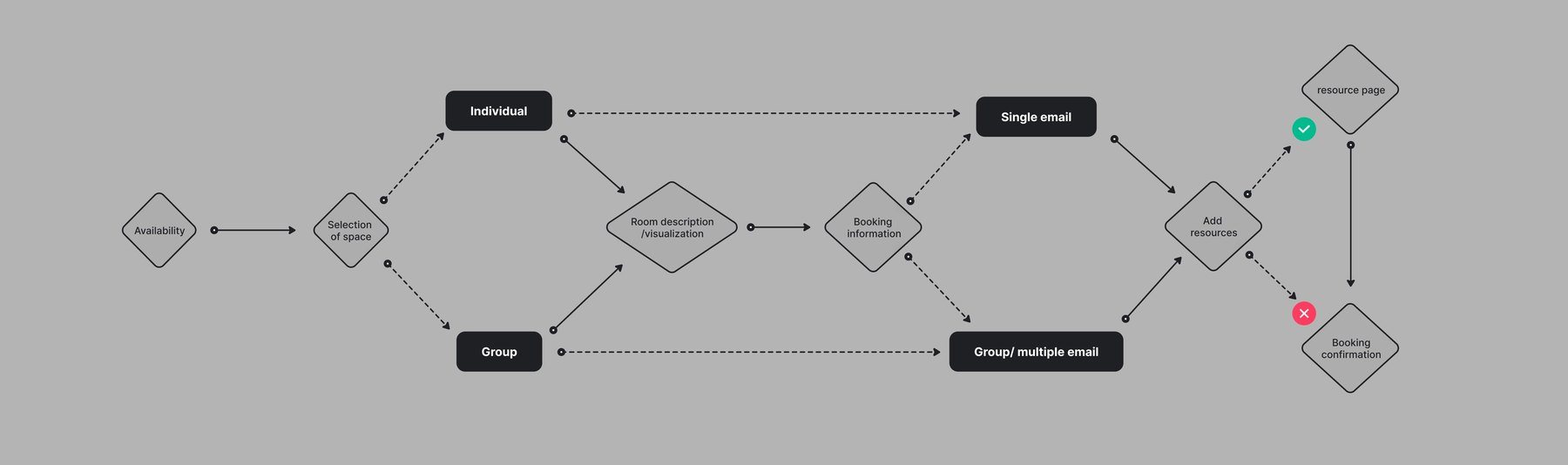
USER FLOW · INDIVIDUAL AND GROUP BOOKING
ITERATION
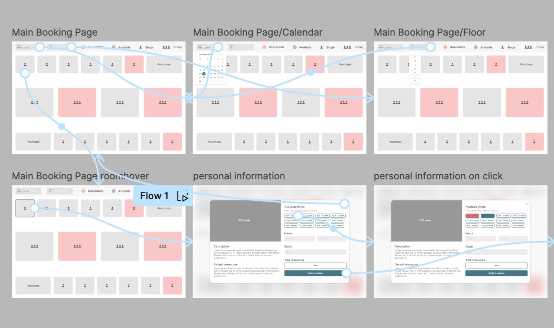
Wireframes, then a second round
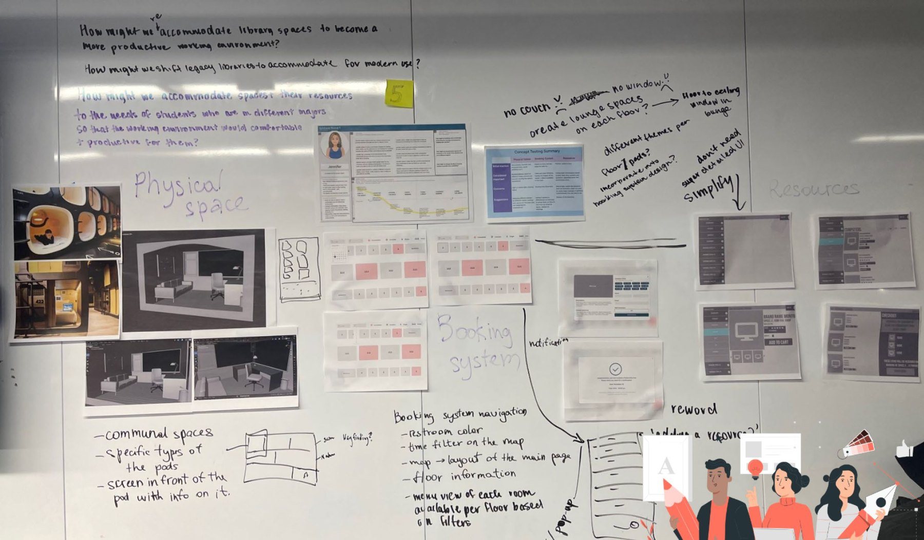
After the first prototype, we went back to users and design mentors for feedback. Three notes changed the design.
LO-FI WIREFRAMES
CRITIQUE WITH MENTORS
FEEDBACK 01
One design language
Use consistent colours across every part, since three of us were designing it.
FEEDBACK 02
Better 3D renderings
Show the unique resources each space offers more clearly.
FEEDBACK 03
Wayfinding
Make it more interactive, so people can explore the space and find inspiration.
DESIGN SOLUTION
See the space before you book it
01
Visualise the space
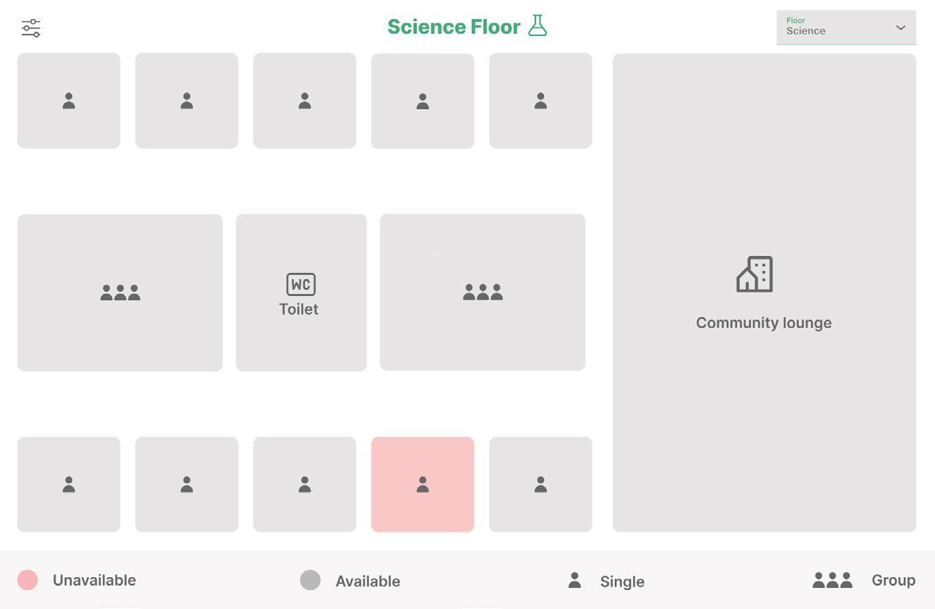
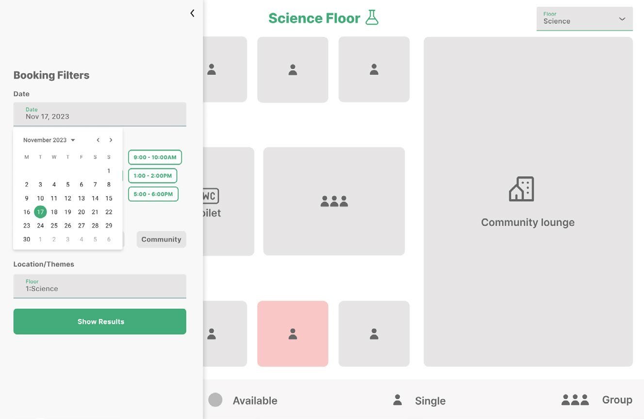
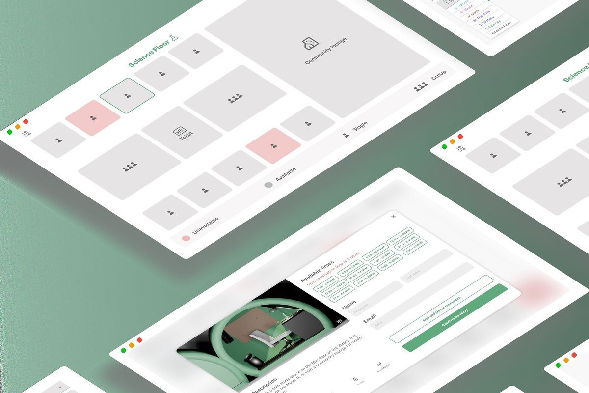
Each floor is shown as a map that separates group and individual study, highlights community lounges and themed floors, and shows what is free right now.
02
Filter to what you need
Pick a date and time window to see only what is available, and switch between themed floors.
03
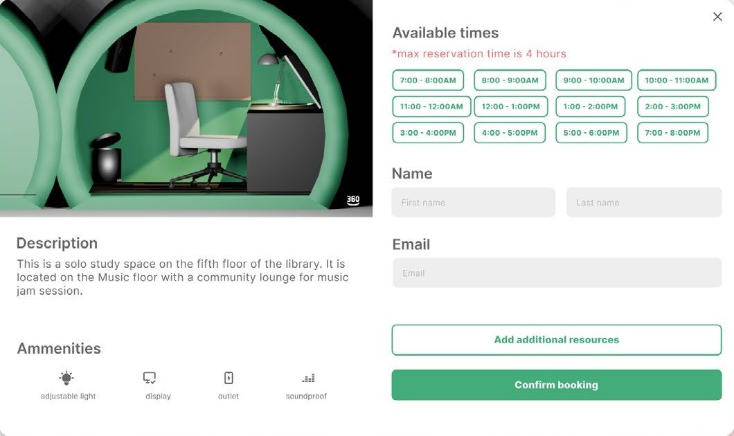
Know what’s inside
A 360° view of each study pod, its amenities, and the option to add extra resources, with a 4-hour cap so nobody overbooks.
WHAT I TOOK AWAY
01
Observe before designing
Watching people in real libraries showed us problems interviews alone would have missed.
02
Fairness is a design choice
A simple time limit did more for access than any visual change could.
03
Shared systems need shared rules
Designing one part of a team project taught me why a common design language matters.